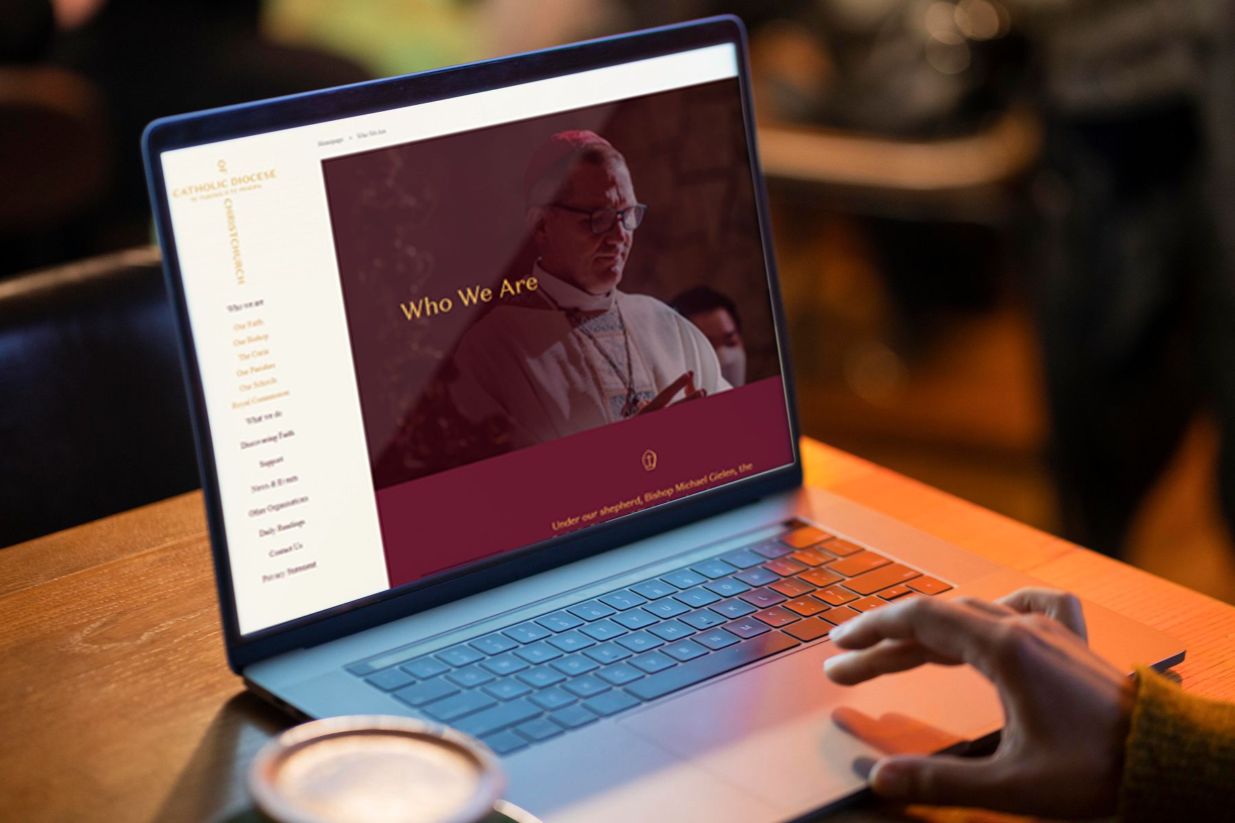
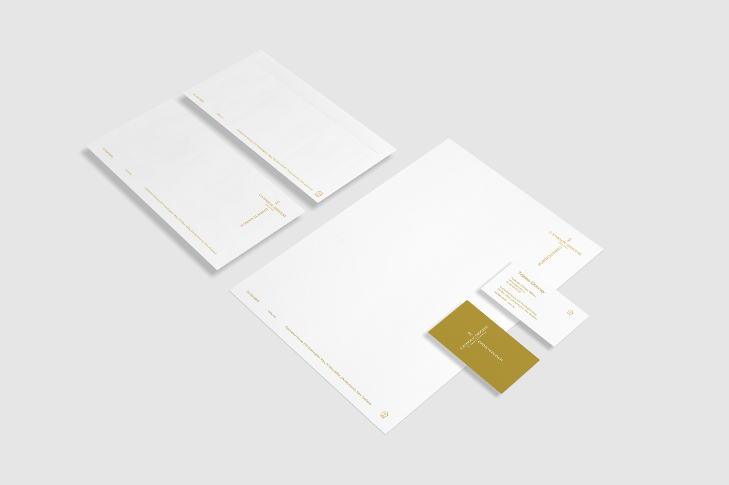
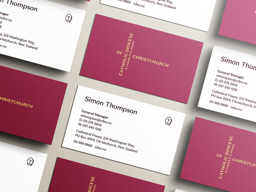
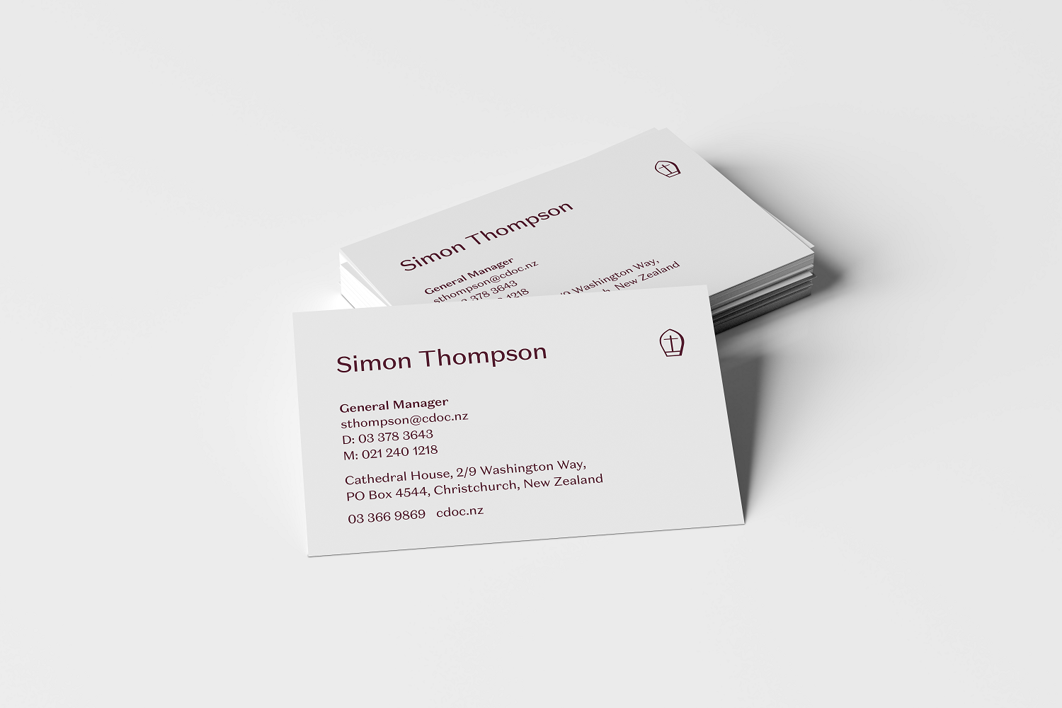
A new look for our Diocese
We are entering an exciting new chapter for the Catholic Diocese of Christchurch under the stewardship of a new Bishop. Therefore we have designed a new logo and visual identity for the Diocese.
As we strive to fulfil our mission to grow God’s church, it’s more important than ever to look, and sound, like one welcoming, cohesive Catholic organisation as we support our Bishop, and our Priests, parishes and schools in the pastoral mission of the Diocese.
Our new visual identity is inspired by the rich traditions of the Church but with a fresh and modern look that embraces Te Reo.
Together the brand elements reflect the vibrant and diverse community that we are creating.
With one unified identity, we have a single, consistent presence across our Diocese and within the agencies that work together to form the Catholic community and undertake the good works of the Church.
The colours of our brand identity are inspired by the liturgical colours of the Catholic year.
Crimson / Purple reflects the colours of advent and lent and symbolise penance, preparation and sacrifice. Green represents ordinary time and symbolises: hope, life and anticipation. Gold is inspired by the colour of vestments and the other objects we see every day in the church.
Our new identity means we also have a new website, stationery and communications material that carry our new look. We hope you love them as much as we do.
With every new visual identity, there will always be some time needed to get used to it. Design can be emotional! However, we are confident that this brand will ultimately help us welcome more people to experience and enjoy the mission of God’s Church.